Harriot Whitbread Witch’s Heart Pendant, Easter 1764
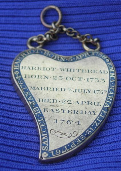
Harriot Whitbread, née Hayton, was the wife of English brewer and Member of Parliament Samuel Whitbread (1720-1796). She was born on the 23rd of October, 1733, married Samuel on the 7th of July, 1757 and died on the 22nd of April, 1764, which was Easter Day.
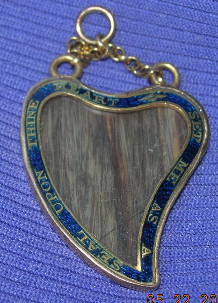
“Set me as a seal upon thine heart”
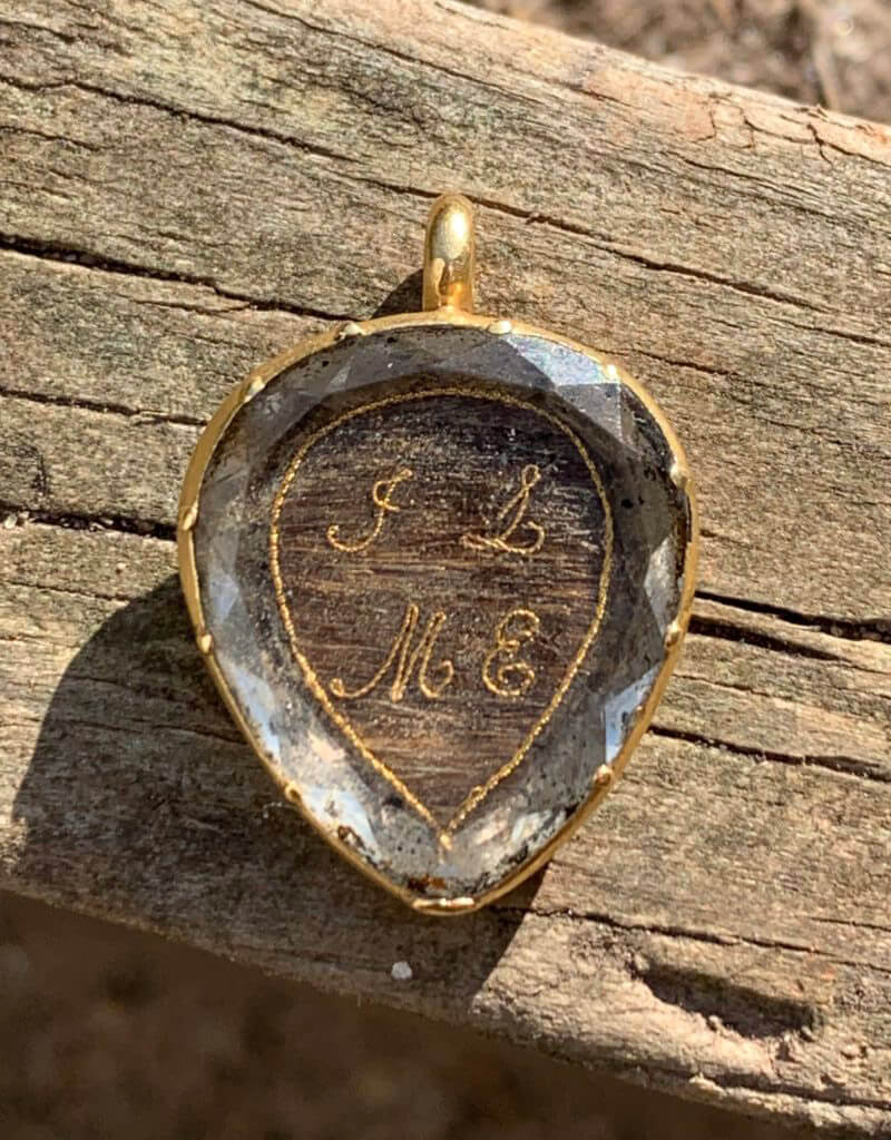
This pendant was made to honour her, being a jewel which was to be a ‘seal upon the wearer’s heart’, in duel symbolism with the heart-shape of the pendant itself. On the reverse are the names of Harriot’s children and their birthdays, being; “Harriot, born 5th April, 1758, Emma. Maria. Eliz 12 Sept, 1761, Samuel 18 Jan 1764.”
Most striking is the shape of this heart. Known as the “witch’s heart”, this pendant has the south end of the heart twisting to the side, which is the primary feature of the heart itself. Witch’s heart jewels most commonly twist to the right side of the jewel (from the viewer’s angle) and have their origins in the 15th century. Modern interpretations stem from the Scottish Luckenbooth brooches, which show two interconnected hearts with a crown above. Their name originates from the luckenbooths in Edinburgh where jewellery was sold, the name translating from Scots to lockable stalls/closed booths/workshops which were situated on the Royal Mile.
Witch’s hearts were worn for their ‘magical properties’, that being to ward off evil spirits and protecting loved ones. Interpretations in jewellery often change over time, through the changing perceptions of symbolism and society. In the 18th century, they were tokens of love, in that the giver was ‘bewitched’ by their love.
Stylistically, this pendant is quite unique. It comes at a time when the sentimentality of the Rococo period was morphing into the Neoclassical style, hence there is no precedent following it or preceding it. It is truly an individual piece, which could have been made in quantity for family members, as there isn’t a great deal of hair utilised from Harriot, and its construction is simple. Being a member of high society and the wife of a Member of Parliament, Harriot’s pendant would also be a fashionable statement. From its use of blue enamel and bespoke design, the piece amplifies the sentimentality of the heart and tailors it to her.
Hearts and Dedications
The heart is the most important element of focus in this pendant, as it is the first identifier for what the jewel represents for the wearer. Being seen from a distance when worn at the neck means that this pendant was clearly a statement of love and affection, which relates back to the relationship status of the wearer. When the heart was worn for a loved one who was alive, it was a symbol of betrothal, marriage or love and affection, or if dead, grief for the departed. With the rise of cupid in sentimental jewels, the heart was a popular motif from the 17th to 19th century, but one which obviously resonates just as strongly today, as the production of heart-shaped pendants and lockets is still a popular design in jewellery.
The heart has its origins in jewellery from the 15th century, but was enhanced in the 17th through the Enlightenment and the reflections of the humanist movement, but could also be appropriated for religious undertones when necessary.
It is important to note that the heart shape which we understand today is still reflected in these jewels with the broad element of the shape. Upon viewing, the north of the pendant doesn’t have the sharp dovetail into the centre of the pendant, but rather curves around itself. The familiar shape is seen at the south of the pendant, with the edges coming to the familiar shape of the heart that we recognise today. Elements of the heart shape had been perfected by the early 17th century, but the adaptation of the shape was common for sentimental jewels through the 18th and early 19th century, due to many other factors of the design flanking the shape and adding to its form.
The witch’s heart in this jewel is the evolution of the shape from the 17th century, particularly utilising the Neoclassical design as its prominent style. Note the use of the thick band to the border of the piece, where the dedications are set. This is quite typical for rings, brooches, bracelet clasps and pendants for the time.
As written about extensively at Art of Mourning, the heart is one of the most important sentimental love symbols in early-modern history. Its obvious symbolism resonates today in tokens of love and affection, moving beyond religious and social values to be the most purely recognised understanding of love. With an anthropomorphic design, the heart symbol became popular in the 17th century with its romantic undertones of giving ‘your’ heart to another.
Colours of Enamel in Jewels
Colour theory is nothing new to modern times. Colour is the identity of emotion, be it red for passion (love or anger), black for death or blue for royalty (a more modern concept). This Sherman ring uses green as a colour for its primary use of mourning, but the question is why. To understand this pendant and its use of blue and black enamel, it is important to look back upon the evolution of colour in mourning jewels to see how colour was used and why. Since the Renaissance, coloured enamel in jewellery was not uncommon, with various techniques taken from classical methods to be applied to jewellery construction. From the Cloisonné, where wire creates the definition of the enamel filling, being an antique technique, but seen in use from 12th century examples, to the champlevé, where the ridges are filled with enamel. Any technique which could be used to infuse a jewel with colour meant that its identity could be changed depending on what the colour was. For a jeweller, particularly in the 1840s onwards, having enamelled jewels with specific colours pre-designed would be easy to tailor for anyone wanting an interior inscription for sentimentality.
Green enamel shouldn’t be seen as a modern invention on jewels from the 19th century. In this early 17th century ring, one can see the remnants of the green enamel in the shoulders of the ring, balancing with white enamel, used effectively here for bones. The Latin inscription states ‘FOELIX CONCORDIA FRATRUM’ (a happy concord of brothers), bringing this memento mori ring into the realm of fraternal love in its construction, rather than being of direct mourning connotations. Rudoe and Dalton also have assumptions about the piece:
Text from Dalton 1912, Catalogue of Finger Rings:
‘Compare nos. 812-22, which, not having names or initials, have been classified as devotional. Rings of the memento mori type were, however, used as mourning rings; jewellers probably stocked them, and names or initials were subsequently added to order… they may be regarded as potentially mourning-rings, though some might equally well be considered devotional.’ The inscription indicates that this ring commemorates the death of two brothers – perhaps twins- who died at the same time. The back of the bezel bears a letter H above I and A, the standard way of indicating two members of the same family: the initial letter of the surname above and the initial letters of the two Christian names below (J. Rudoe, 19.11.03).
If this was a ring which had been used for the dual purpose of being a memento mori ring and also for mourning (they weren’t originally mutual as a concept), then the ring may have been worn as a token of personal identity first, between brothers, then tailored for the purpose of mourning later. Regardless of this, the nature of the green enamel as being a balance of colour for the skull and the bones is simply a colour which was fashionable. The concept of rebirth and rest hadn’t been introduced until the Romantic period. It was only by the 18th century that synthetic dyes had replaced vegetable pigments and dyes in art, which led to a greater permeation of green as a visible colour in design and arts. When something is ubiquitous enough, then it can gather a meaning which a population can understand, but this ring was early enough for the colour to resonate design over symbolism.
Memento mori jewels and those of the late 17th and early 18th century benefitted from the use of material in their construction, as they could involve colours easily and adapt. In the above example, the use of green is seen to be the basis of material which the cipher and crystal sit upon. Most interesting about this ring is the use of silver over gold and the integration of the garnets into the shoulders, which all balance to make this quite an opulent ring for its time. In its use of green, there is more of a personal slant to the nature of the ring, rather than being a symbolic meaning for identity.
The above examples are nearly a century apart, finding their difference between mourning and sentimentality, with one being at its height for memento mori style (adapting to mourning through the use of the skull/crossbones motif later on) and the decorative faceted crystal, rosette reverse bezel of the early 18th century. Both use green as an identifier, yet neither place the colour above the sentiment itself. It could be argued that the latter ring has more identity, due to the material being intrinsic to the family/individual who is being remembered. This is not uncommon, be it a piece of material that was worn, kept or even from the funeral of the deceased, which has been seen in latter 18th century jewels.
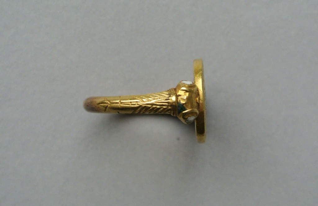
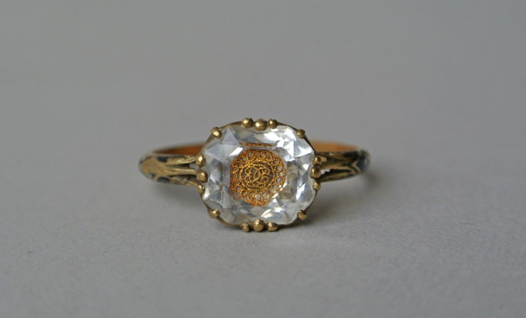
More interestingly is this ring from c.1700, with the reversed enamelled bezel that had been popular since c.1680. This variation is highly decorative, whereas most others show enamel in the rosette shape inlay, this has the enamel inlay to a hammered pattern. The green still shows through at the star-shaped pattern on the reverse, balanced with blue enamel and the white dots, perhaps reminiscent of the night sky. Blue enamel representing royalty as a loved one who is considered royalty.
The use of blue enamel (used for royalty and suggesting that one was considered royalty) contains many mixed histories. Over time, many of the messages surrounding cobalt glass and blue enamel have been crossed, yet it fit very well into the Neoclassical paradigm post c.1865. The main reason for its use in heavier, symbolic terms is that the Neoclassical reliance on sentimental depictions and the allegories of love put the reliance on peripheral representations, rather than clear-cut statements of love and faith. Hence, blue enamel, considered royalty.
There’s Royal Blue and there’s Bleu de France. Bleu de France has been representing France and the French monarchy and the heraldry since c.12th century. This was adapted into jewels and you can see the obvious connection there with the message of royalty, especially considering the French influx into other cultures, as the French were considered the focus of style and fashion.
Royal Blue, is darker, with a hint of purple and red. This was thought to have been invented by millers in Frome, Somerset during a dress making competition for Queen Charlotte post 1761 (after she was queen). There’s the connection here in that her style would dictate a lot of the aristocracy would consider high fashion.
They were created for their sentimental reasons, but either for the use of the initials or the skull (with its reverse initials) identifying what their statement meant kept the design relegated to the primary motif in the bezel. There were not completely green coloured mourning jewels for the sake of identifying death. Death was used in black and white, each being an extreme to show death as its entropy, or white for its purity, but neither being green, blue or red as a primary colour.
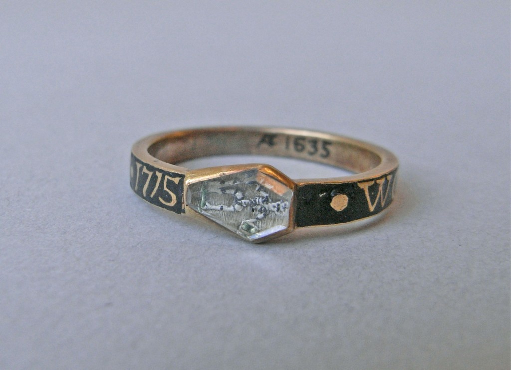
By 1715, the memento mori symbols had changed from what we’ve seen in the first ring to become the symbol of death, the loss of time and eventual judgement. These symbols engrained within society the nature of living a life for eventual death and what the afterlife would bring. In this 1715 example, the use of the green enamel is quite clear upon the hour glass (tempus fugit), in which time flies and this is the symbol of life. As with the previous jewels, this is a symbol that is not the primary colour (in this case, being black). Green is used here as the fire of the torch, which the skeleton is holding. Green replaces the orange/yellow/blue fire, but also lends towards the fire burning brighter as an extreme temperature as well as a decoration.
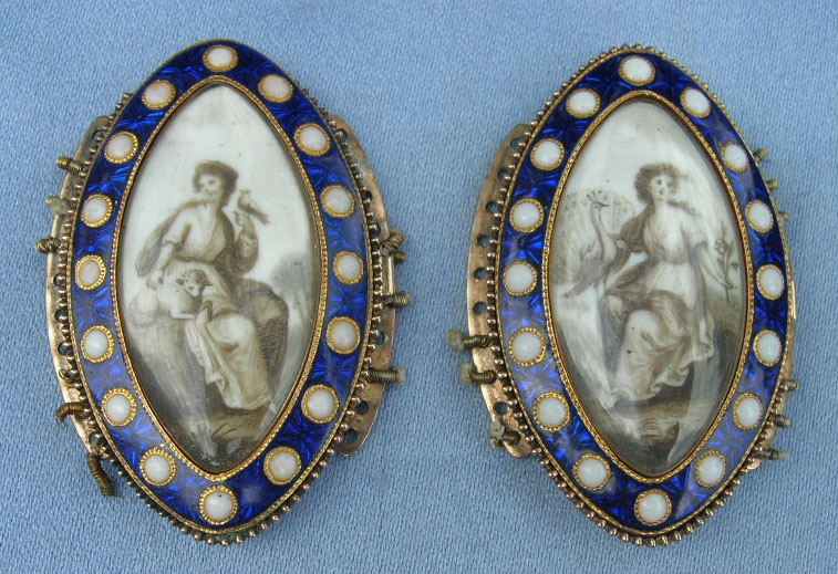
On the reverse of miniatures and on the trim or border of brooches or clasps, green enamel or green foil, was seen as a popular way of denoting status of love and sentimentality through colour. Being further removed from the jewels seen earlier, green was now becoming a colour that could be identified with rebirth, growth, renewal and rest. The Romantic period had influenced jewellery through art by stating that colour theory was important and not a periphery to the symbolism seen in art and jewellery. Previous to the above jewellery, an urn or column with burning hearts would be seen; clearly showing death or love in its statement. Now, it was the use of colour, pearls and the simplicity of the woven hair in a dedicated area.
The 1860s and the latter 19th century didn’t change the conceit of green as a symbol, but only used it sparingly where it resonated with the wearer/person whom commissioned it.
What is interesting about all of these jewels is that as they progress, there is still the balance of white enamel with the green enamel. If used for the purpose of death, white (purity/innocence) and green (rebirth) is almost a call for the unmarried, virginal youth to grow once more. Be it literal or for the sake of sentimentality, green enamel began to take its form as a colour which was acceptable during the third stage of mourning.
This resonated through to the 20th century with the Romantic Revival of the c.1900 period, where jewels used colours frequently and utilised green as a colour in enamel and foil to replicate the styles of the early 19th century. Miniatures and oval styles found their place in mainstream jewellery designs during the pre-WWI era of the 20th century, where some jewels are so perfectly replicated that they can only be judged by their weight.
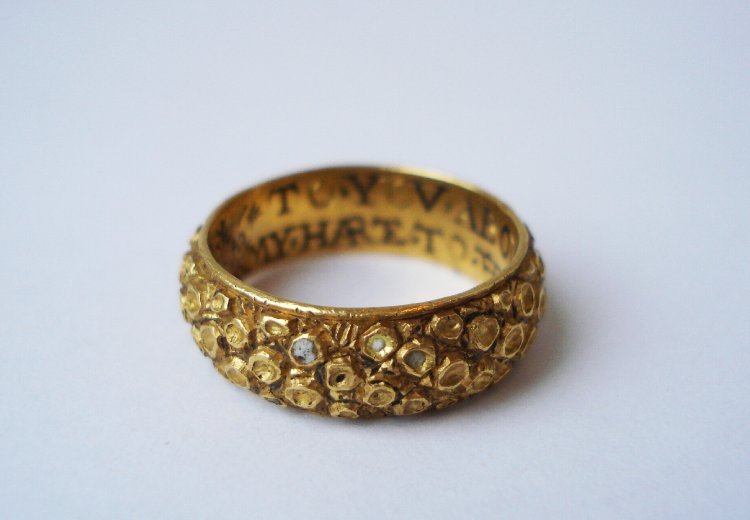
Black enamel is possibly the most common and identifiable of the enamel colours to be seen as that of a death identifier. What we’ve seen in this green enamel ring is that death did not have to be resonate of black, but other colours could be used for mourning. Showing an example from the 16th century, this is an early ring to feature black enamel inlay inside the ring itself. This piece has the inscription:
“*TO*YOV*ABOVEN*ANI*CREATVRE
MY*HARTE*TO*THE*DETHE*SHAL*ENDVRE”
“To you above any creature / my heart to the death shall endure” – written in a phonetic way (prior to the creation of the English dictionary) to show the influence of death as a motif, hence the black enamel, with the loving sentiment that goes with it to unify the couple forever. Without the standardisation of the English language and the written reliance on Latin previous to the dictionary in 1755, posie rings are a remarkable time capsule for phonetically capturing their surrounding language in a jewel. From a status perspective, this utilisation of language is accessible to a strata of society that didn’t have the luxury of formalised education, opening up sentimental jewels to new levels of society. Basic sentiments of love etched into silver and gold bands could now be given as a secret love token for a growing middle class. In rings previous to the 16th century, more common would be the inscriptions written in French, Latin and Norman French.
Chapbooks, pamphlets containing popular literature, were a popular source for many of the sentiments written inside the posie rings. These cheap pamphlets grew in popularity, as they were sold cheaply (commonly a penny or halfpenny) and contained many popular ballads from the time. This pre-dates mass produced media of the early 19th century, when steam presses led to the rise of cheap newspapers. From the mid 16th century, these cheap and crudely produced booklets contained relevant popular content that varied from entertainment to political and religious content. Here, the relation of the ring to the popular literature is the key factor in understanding just how the posie’s relation to society. They were jewels that could be for the commoner, but also transient as a style of love token through society because of their simple statements.
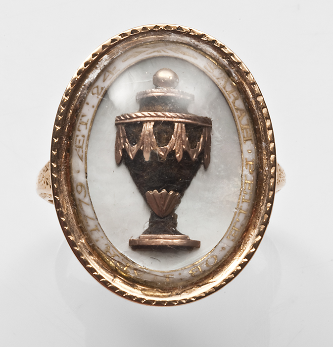
As seen through the above examples, black enamel had already been appropriated into the lexicon of death. Death, being the entropy with an absence of light, gave itself into the paradigm of mourning since ancient times. It is in contemporary and closely modern jewels that the use of the colour is important. This ring was created in 1764, the onset of the Neoclassical period, which gave allegorical depictions of love and death to jewels, but it carried on to be the primary symbols to this very day. In the above ring from 1803, the urn is used, set in black enamel and diamonds, to denote the death of the loved one.
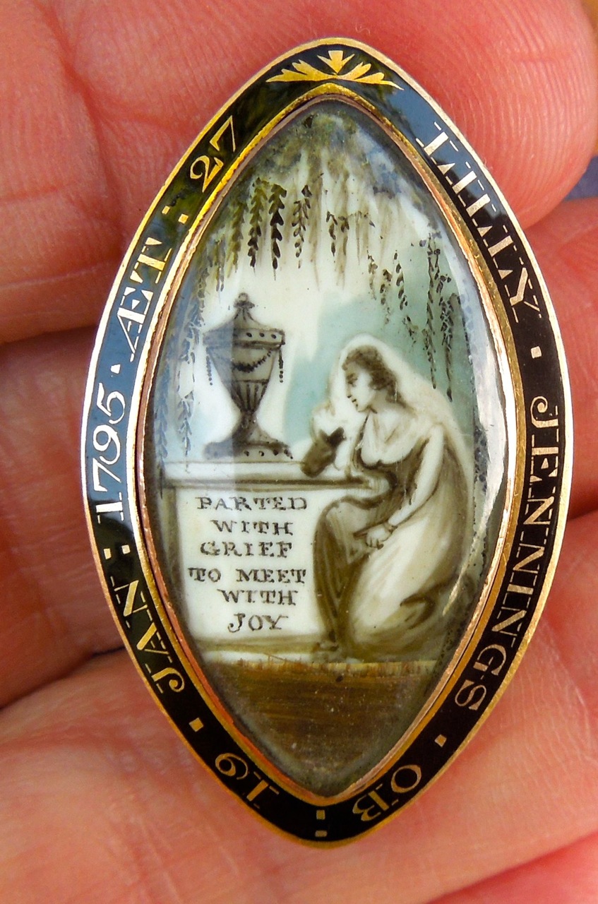
Set in black enamel meant the symbolism of death, however, the bespoke setting of the border in a jewel was individual to the wearer. Whomever commissioned the jewel has the gold recessed and the enamelled filled into the surrounding area for it to show as it does in these jewels. Borders of the jewels are important for goldsmiths to personalise a jewel, while still utilising much of the design skill that it takes to balance the text and font in a navette jewel. This was important post 1780, which the Harriot jewel is previous to and sets a trend, making her witch’s heart even more important as a catalyst.
18th Century Sentimental Style
Harriot’s pendant combines many of the most popular elements of the 18th century and jewellery development, but makes them individual. Even to the dual-chain loops at the north of the ring, this heart does not cut any corners in its design. Worn over the heart, it is a message or tablet, showing that the love held for Harriot is deep within the heart of the wearer. As seen through its use of black/blue enamel and how utilisation of the heart, it shows that design needn’t be as overwhelming as the Rococo period. Large floral and natural motifs were common not long before this pendant was constructed, yet this piece has all the refined style of the upcoming Neoclassical period.


