Memento Mori in Jewellery: Anachronistic 1780s White Enamel Ring Where Memento Mori Meets Neoclassicism
Continuing our look at memento mori in jewellery through the ages comes this stunning piece from the collection of Marielle Soni. This particular piece jumps ahead of our previous example from c.1680 and we go directly to 1780, in future articles, I will fill out the 1720s-1760s, so you can all see how the memento mori symbols were used in their context.
This brings us back to the primary themes of the these pieces and that is; what is the nature of the symbolism, why is it used, why would it have been commissioned and how would it have been worn?
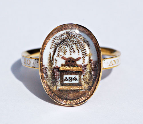
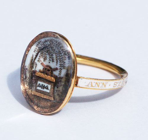
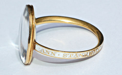
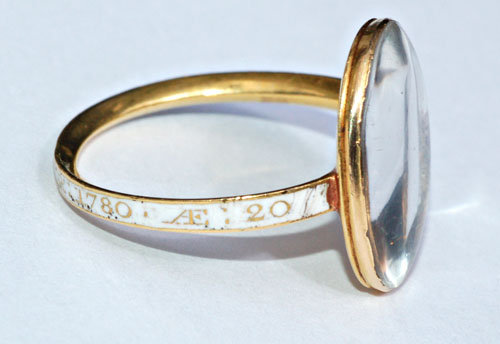
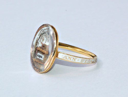
Firstly, let’s look at the facts. The ring is dated 1780 and dedicated to Anne Staneway Obt 8 Mar 1780 AE 20. There is white enamel, domed crystal, the sepia painting and high relief tomb motif with the skull and crossbones on top, painted on the tomb is ‘tempus fugit’ (or ‘time flies) as the winged hourglass . There is the willow, cypress and all this sits underneath a piece of domed crystal. The bezel measures 3/4 inch by 1/2 inch and the band is 1/8 inch wide.
Judging from the construction, this piece is in quite original condition. Much of the time, sepia in such fine condition has been doctored with pieces today in order to repair or fetch a higher price, also, the crystal is another telltale sign that there has been some repair work. Often, glass has replaced with bevelled edges, as it’s much harder and more expensive to replicate this. From this piece, right down to the wear of the white enamel, it’s as it was and as it should stay. Visually, to see the richness of the white ivory and the enamel together really make the sepia and high relief gold/hairwork pop out at the viewer. This piece was made at a time of experimentation with the Neoclassical style, so much of these practices were still being understood before they became common in production.
Which leads us to the date. This piece stems from 1780, a time when Neoclassicism had become entrenched in mainstream culture and thought. Death, for its morbidity and harkening back to earlier times of less affluence and social mobility, had lost the memento mori symbolism. The meaning of the memento mori symbolism, while still in use somewhat for trinkets to denote the original intent (of understanding mortality), rather than be staunch reminders of death that had been popular in previous generations. This is why this ring is such a curiosity. Personally, anachronisms in design and art are very important to their time and show how much of the person who commissioned the piece influenced what it was. Finding memento mori symbols from this time is a hard thing to do, there were several small revivals, but this is quite personal. The tempus fugit with the original skull and crossbones on top of the Neoclassical symbols shows a direct marriage of style and prominence, the level of grief overtakes the beauty in death Neoclassical depictions would allude to.
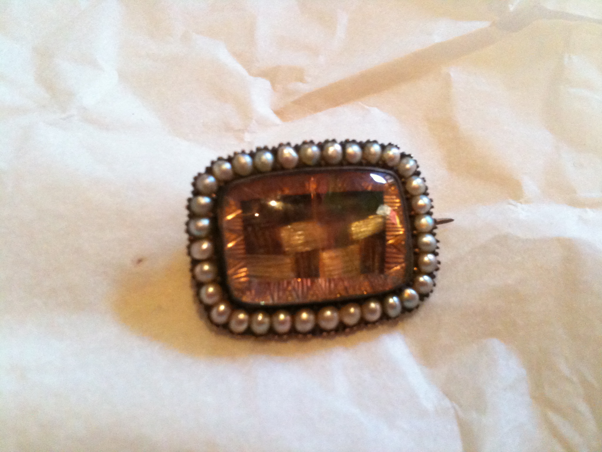
Over to the border of the bezel, note the triangular pattern. This is a pattern and style that pops up quite frequently in contemporary jewellery and is a common setting. Much of the 1790s pieces lost of the order and made the ivory go directly to the edge of the bezel, however, this isn’t a rule. This particular style can be isolated to region and maker, but it did carry across to other forms of jewellery, such as brooches and pendants, either way, it’s quite an elegant way to encapsulate the interior and break away from the shank.
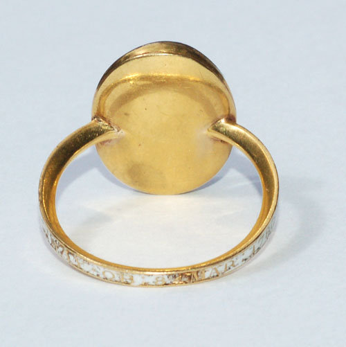
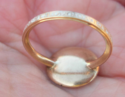
Underneath, the shank connects to the bezel very cleanly, no repair work or obvious joins, showing another sign of quality. Then there is the interior roll of the band. This carried over from the 1760s and is a good way to check for genuine age (in non enamelled pieces that may or may not have the obvious joins to the bezel). This style wasn’t greatly used through the 1790s, as the navette shape became more popular and larger, hence the curved-form fitting cuff shape to the finger was necessary to hold the ring to the finger as it was to look beautiful. This ring, with the oval shape and the rolled inner band really speaks for the height of its time.
I think the symbolism speaks largely for itself, the willow is sadness, the tomb/plinth shows the mortuary, skull and crossbones is death, the tempus fugit shows that time flies, cypress points towards the heavens and the white enamel is for the unmarried/virginal Anne Staneway. To apply some sort of subjective consideration to this, one may consider that the ring was commissioned by a parent for family member, but one may consider that it was for an older member of the family who still had resonated with the anachronistic thought of the previous generation’s memento mori motifs. Complete supposition, however, as there is no evidence to back this up and it may as well have been sold directly from a pre-painted ivory.
For more information on Anne, she was the daughter of John and Edith Stanaway the daughter of John and Edith Stanaway [n.b. non-standardised 18th century spelling] and born in Melcombe Regis, Dorset, England in 1760.


