1803 Green Enamel Mourning Ring: Part 1
Share this article with...

Enamel is the primary identifier for mourning and sentimental jewels, with colour being the most iconic and simplistic way to denote emotional symbolism. Its colours denote the sentiments of love, passion, respect and death. The Romantic period and its influence of change to the Neoclassical period of the late 18th century to the mid 19th century changed the perception of allegorical art, influencing the rise of enamel and gems in mourning and sentimental jewels to take the predominant design focus over the previous allegorical depictions of classical figures in moments of mourning and sentimental love. This was a reaction to the Age of Enlightenment and scientific theory (also relating to historical rediscoveries), introducing love and emotional art identifying the self. This had an impact on liberalism and nationalism. A more simplistic view is that the Enlightenment helped to challenge ecclesiastical thought through science and bring the focus of life to the self, while the Romantic period used this to identify emotion as being the essential element of what it meant to be an individual.
In this champlevé enamel ring, where recessed metal was filled with enamel, a mourning ring emerges in green for Thomas Sherman, who died on the 6th of February, 1803 at the age of 63. The age of this ring puts it directly into the light of the change in the Neoclassical period to the Romantic, with the c.1800 year being very important in peripheral jewels to see the effect of how style was changing. In this article, we shall investigate mourning bands and how their development changed through the early-modern period and how this ring came to be.
The Colours of Green, Blue and Black
Colour theory is nothing new to modern times. Colour is the identity of emotion, be it red for passion (love or anger), black for death or blue for royalty (a more modern concept). This Sherman ring uses green as a colour for its primary use of mourning, but the question is why. To understand this ring and its use of colour, it is important to look back upon the evolution of green in mourning jewels to see how the colour was used and why. Since the Renaissance, coloured enamel in jewellery was not uncommon, with various techniques taken from classical methods to be applied to jewellery construction. From the Cloisonné, where wire creates the definition of the enamel filling, being an antique technique, but seen in use from 12th century examples, to the champlevé, where the ridges are filled with enamel. Any technique which could be used to infuse a jewel with colour meant that its identity could be changed depending on what the colour was. For a jeweller, particularly in the 1840s onwards, having enamelled jewels with specific colours pre-designed would be easy to tailor for anyone wanting an interior inscription for sentimentality.
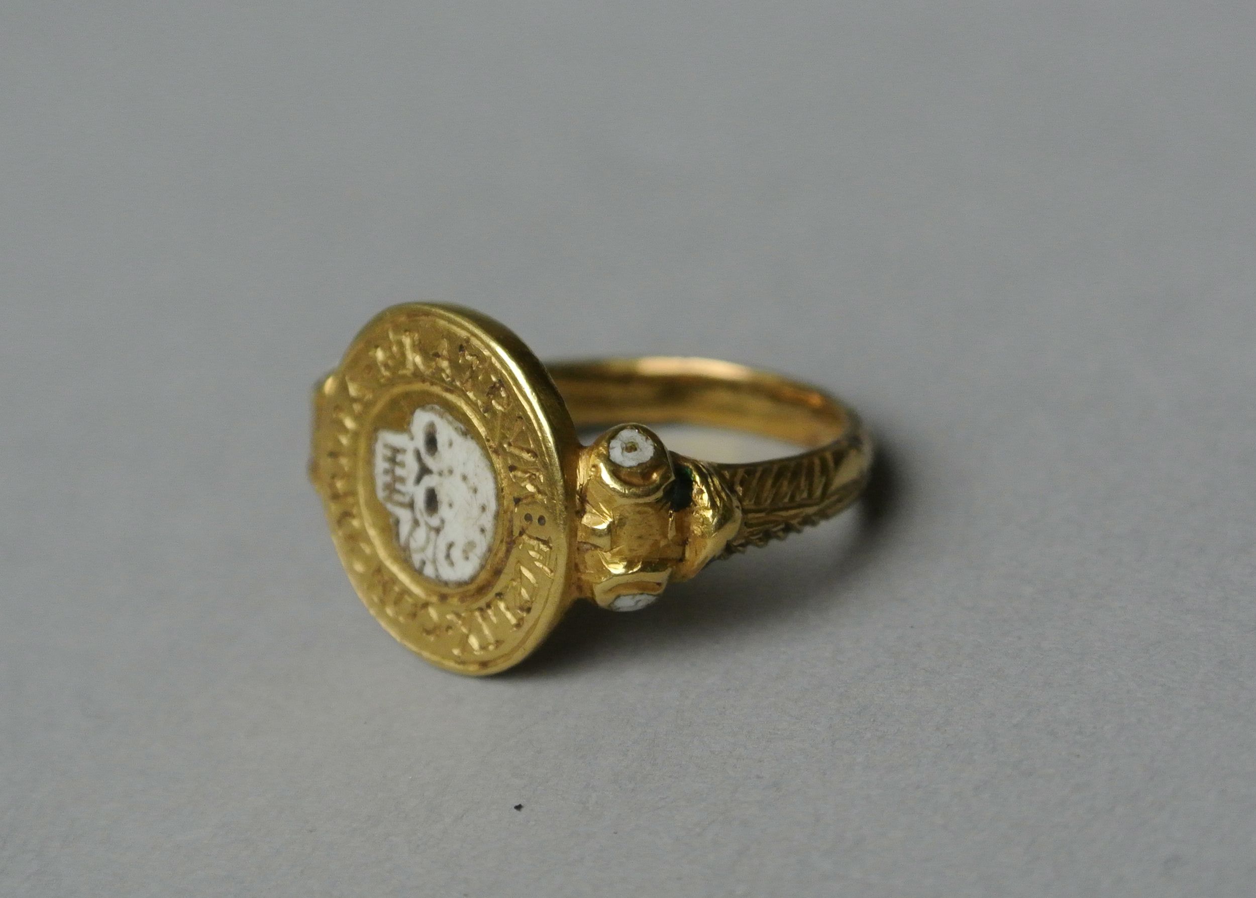
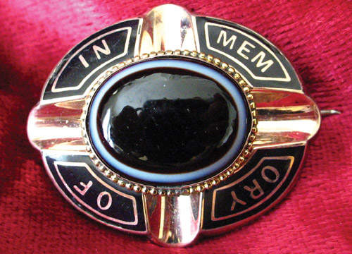
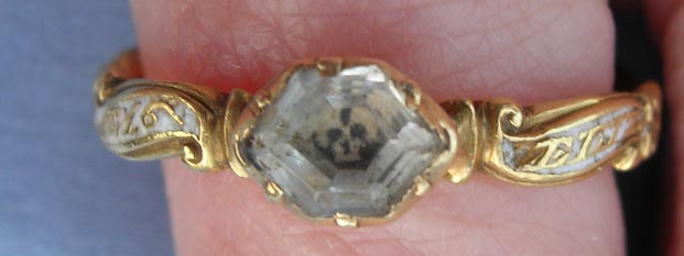
Green enamel shouldn’t be seen as a modern invention on jewels from the 19th century. In this early 17th century ring, one can see the remnants of the green enamel in the shoulders of the ring, balancing with white enamel, used effectively here for bones. The Latin inscription states ‘FOELIX CONCORDIA FRATRUM’ (a happy concord of brothers), bringing this memento mori ring into the realm of fraternal love in its construction, rather than being of direct mourning connotations. Rudoe and Dalton also have assumptions about the piece:
Text from Dalton 1912, Catalogue of Finger Rings:
‘Compare nos. 812-22, which, not having names or initials, have been classified as devotional. Rings of the memento mori type were, however, used as mourning rings; jewellers probably stocked them, and names or initials were subsequently added to order… they may be regarded as potentially mourning-rings, though some might equally well be considered devotional.’ The inscription indicates that this ring commemorates the death of two brothers – perhaps twins- who died at the same time. The back of the bezel bears a letter H above I and A, the standard way of indicating two members of the same family: the initial letter of the surname above and the initial letters of the two Christian names below (J. Rudoe, 19.11.03).
If this was a ring which had been used for the dual purpose of being a memento mori ring and also for mourning (they weren’t originally mutual as a concept), then the ring may have been worn as a token of personal identity first, between brothers, then tailored for the purpose of mourning later. Regardless of this, the nature of the green enamel as being a balance of colour for the skull and the bones is simply a colour which was fashionable. The concept of rebirth and rest hadn’t been introduced until the Romantic period. It was only by the 18th century that synthetic dyes had replaced vegetable pigments and dyes in art, which led to a greater permeation of green as a visible colour in design and arts. When something is ubiquitous enough, then it can gather a meaning which a population can understand, but this ring was early enough for the colour to resonate design over symbolism.
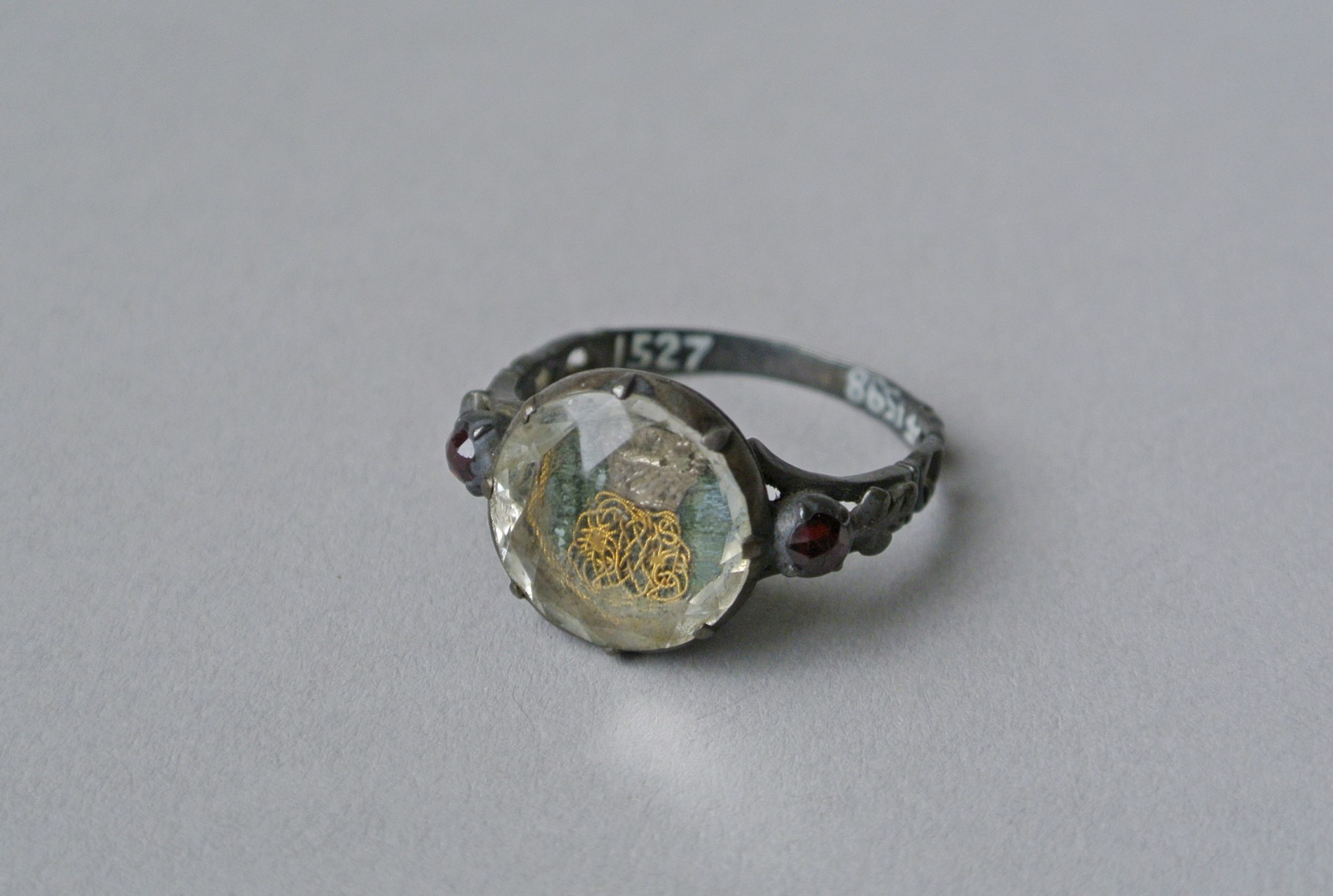
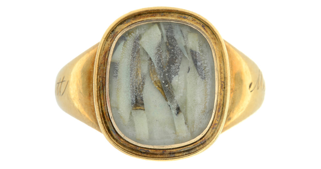
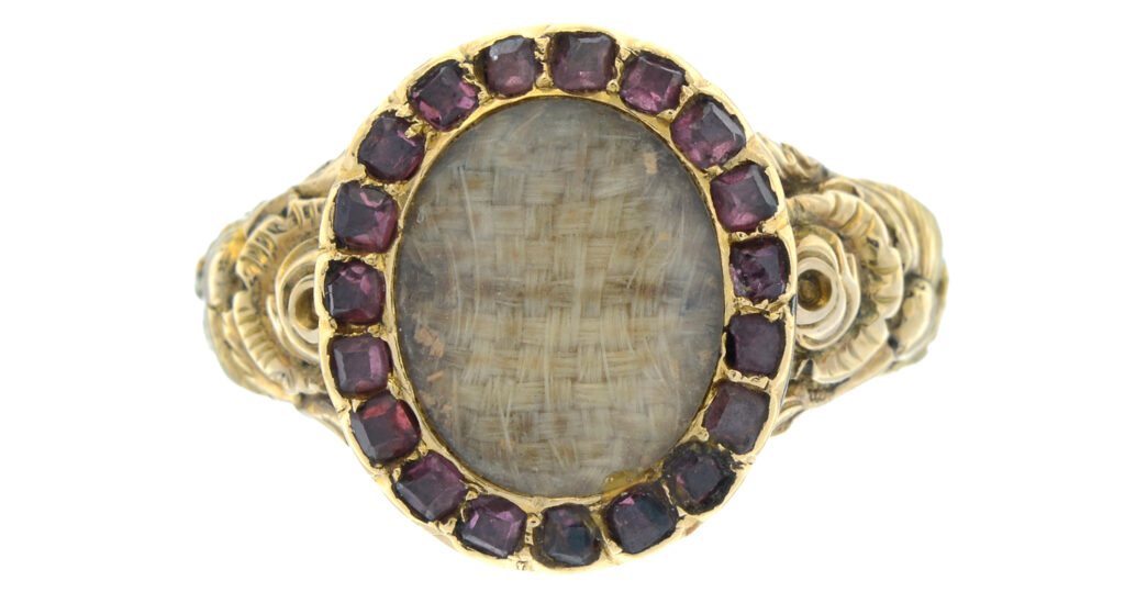
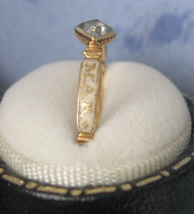
Memento mori jewels and those of the late 17th and early 18th century benefitted from the use of material in their construction, as they could involve colours easily and adapt. In the above example, the use of green is seen to be the basis of material which the cipher and crystal sit upon. Most interesting about this ring is the use of silver over gold and the integration of the garnets into the shoulders, which all balance to make this quite an opulent ring for its time. In its use of green, there is more of a personal slant to the nature of the ring, rather than being a symbolic meaning for identity.
The above examples are nearly a century apart, finding their difference between mourning and sentimentality, with one being at its height for memento mori style (adapting to mourning through the use of the skull/crossbones motif later on) and the decorative faceted crystal, rosette reverse bezel of the early 18th century. Both use green as an identifier, yet neither place the colour above the sentiment itself. It could be argued that the latter ring has more identity, due to the material being intrinsic to the family/individual who is being remembered. This is not uncommon, be it a piece of material that was worn, kept or even from the funeral of the deceased, which has been seen in latter 18th century jewels.
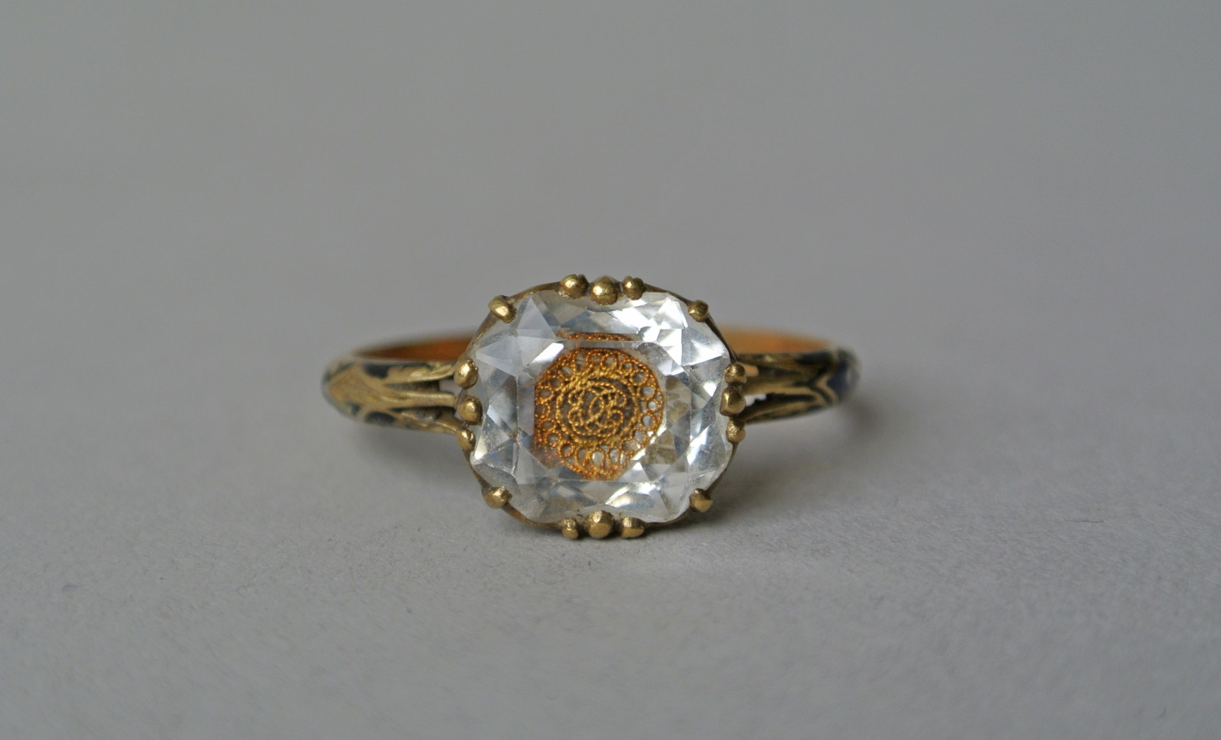
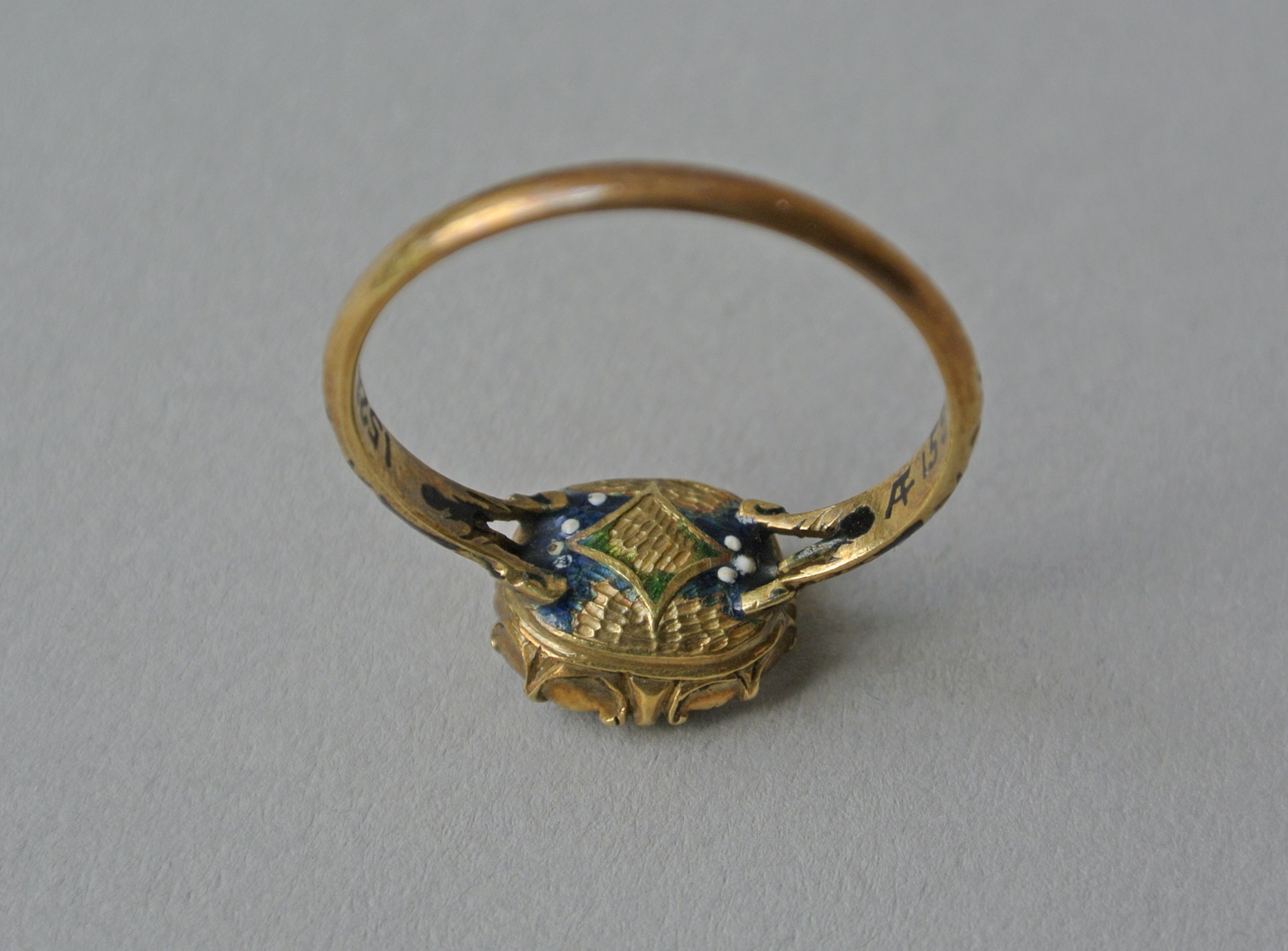
More interestingly is this ring from c.1700, with the reversed enamelled bezel that had been popular since c.1680. This variation is highly decorative, whereas most others show enamel in the rosette shape inlay, this has the enamel inlay to a hammered pattern. The green still shows through at the star-shaped pattern on the reverse, balanced with blue enamel and the white dots, perhaps reminiscent of the night sky.
Green should not be seen as the primary driver for what these jewels stood for. They were created for their sentimental reasons, but either for the use of the initials or the skull (with its reverse initials) identifying what their statement meant kept the design relegated to the primary motif in the bezel. There were not completely green coloured mourning jewels for the sake of identifying death. Death was used in black and white, each being an extreme to show death as its entropy, or white for its purity, but neither being green, blue or red as a primary colour.
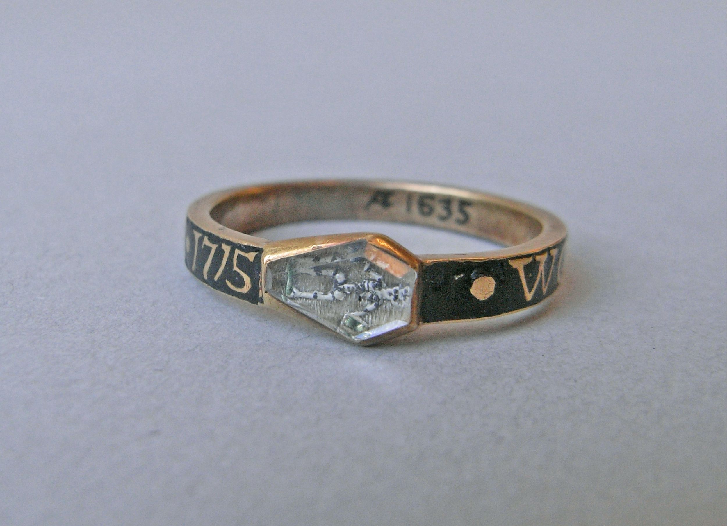
By 1715, the memento mori symbols had changed from what we’ve seen in the first ring to become the symbol of death, the loss of time and eventual judgement. These symbols engrained within society the nature of living a life for eventual death and what the afterlife would bring. In this 1715 example, the use of the green enamel is quite clear upon the hour glass (tempus fugit), in which time flies and this is the symbol of life. As with the previous jewels, this is a symbol that is not the primary colour (in this case, being black). Green is used here as the fire of the torch, which the skeleton is holding. Green replaces the orange/yellow/blue fire, but also lends towards the fire burning brighter as an extreme temperature as well as a decoration.
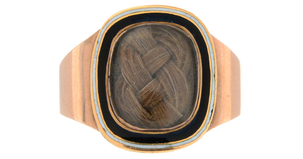
On the reverse of miniatures and on the trim or border of brooches or clasps, green enamel or green foil, was seen as a popular way of denoting status of love and sentimentality through colour. Being further removed from the jewels seen earlier, green was now becoming a colour that could be identified with rebirth, growth, renewal and rest. The Romantic period had influenced jewellery through art by stating that colour theory was important and not a periphery to the symbolism seen in art and jewellery. Previous to the above jewellery, an urn or column with burning hearts would be seen; clearly showing death or love in its statement. Now, it was the use of colour, pearls and the simplicity of the woven hair in a dedicated area.

The 1860s and the latter 19th century didn’t change the conceit of green as a symbol, but only used it sparingly where it resonated with the wearer/person whom commissioned it.
What is interesting about all of these jewels is that as they progress, there is still the balance of white enamel with the green enamel. If used for the purpose of death, white (purity/innocence) and green (rebirth) is almost a call for the unmarried, virginal youth to grow once more. Be it literal or for the sake of sentimentality, green enamel began to take its form as a colour which was acceptable during the third stage of mourning.
This resonated through to the 20th century with the Romantic Revival of the c.1900 period, where jewels used colours frequently and utilised green as a colour in enamel and foil to replicate the styles of the early 19th century. Miniatures and oval styles found their place in mainstream jewellery designs during the pre-WWI era of the 20th century, where some jewels are so perfectly replicated that they can only be judged by their weight.
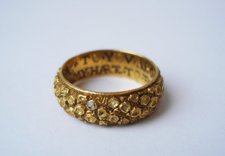
Black enamel is possibly the most common and identifiable of the enamel colours to be seen as that of a death identifier. What we’ve seen in this green enamel ring is that death did not have to be resonate of black, but other colours could be used for mourning. Showing an example from the 16th century, this is an early ring to feature black enamel inlay inside the ring itself. This piece has the inscription:
“*TO*YOV*ABOVEN*ANI*CREATVRE
MY*HARTE*TO*THE*DETHE*SHAL*ENDVRE”
“To you above any creature / my heart to the death shall endure” – written in a phonetic way (prior to the creation of the English dictionary) to show the influence of death as a motif, hence the black enamel, with the loving sentiment that goes with it to unify the couple forever. Without the standardisation of the English language and the written reliance on Latin previous to the dictionary in 1755, posie rings are a remarkable time capsule for phonetically capturing their surrounding language in a jewel. From a status perspective, this utilisation of language is accessible to a strata of society that didn’t have the luxury of formalised education, opening up sentimental jewels to new levels of society. Basic sentiments of love etched into silver and gold bands could now be given as a secret love token for a growing middle class. In rings previous to the 16th century, more common would be the inscriptions written in French, Latin and Norman French.
Chapbooks, pamphlets containing popular literature, were a popular source for many of the sentiments written inside the posie rings. These cheap pamphlets grew in popularity, as they were sold cheaply (commonly a penny or halfpenny) and contained many popular ballads from the time. This pre-dates mass produced media of the early 19th century, when steam presses led to the rise of cheap newspapers. From the mid 16th century, these cheap and crudely produced booklets contained relevant popular content that varied from entertainment to political and religious content. Here, the relation of the ring to the popular literature is the key factor in understanding just how the posie’s relation to society. They were jewels that could be for the commoner, but also transient as a style of love token through society because of their simple statements.
Black Enamel & Band Development
Black enamel bands developed from the posie style in the 17th and 18th centuries, standardising at a time when the green enamelled ring of today took the mainstream design based upon the change of art in society.
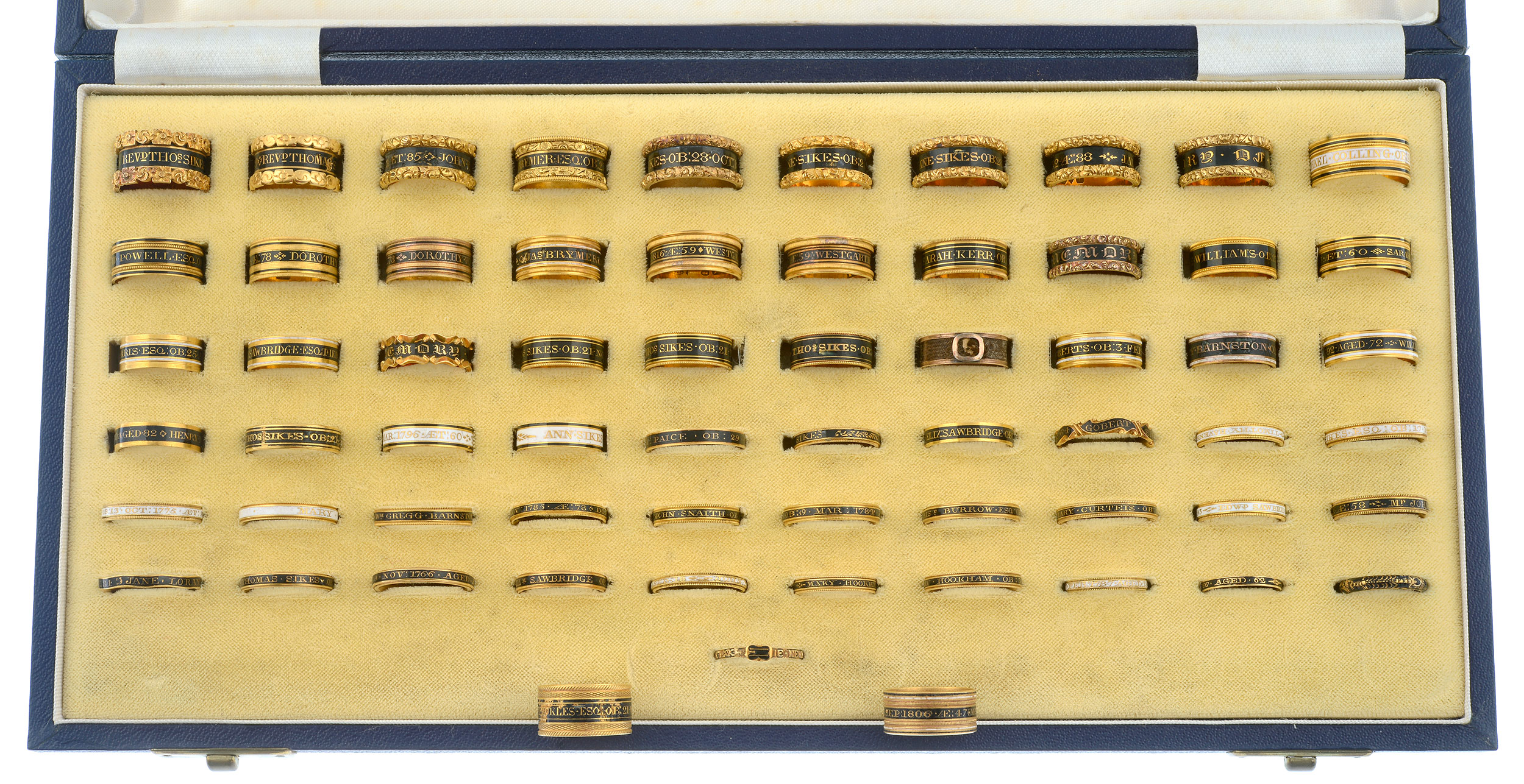
Black enamel bands are the most recognised of mourning jewels, being placed in very visible positions for others to see, easy and cheap to manufacture and all for the purpose of creating the wearer to be a walking tombstone for the person who is deceased. Their ability to be re-appropriated or kept by a family lineage is important, as these rings are far more important as tokens of remembrance and genealogy, as opposed to their commercial value.
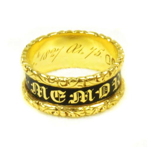
By looking at two different eras of mourning rings, we will see their importance as cultural markers. The following ring is from 1827:
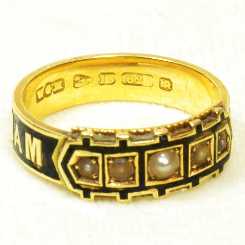
And this ring is from 1881:
What can be gathered from the two different eras, times when the meaning of mourning and the imposition by Court values created the necessity of mourning?
Firstly, the design of the ring speaks in volumes to the society within which is was created. The first example from 1827 has the excessive flourishes around the edge of the band which were incredibly popular in jewellery design of the 1820-40 period. This was ushered in through the Gothic Revival period and its use of the Rococo styling that was can be seen in architecture (such as cornices) and furniture design. Its use, combining floral and acanthus motifs, are decorative and dominating, imposing a style which was opulent upon a society that was moving away from the excess of the Regency Era and towards the simpler pre-Enlightenment Christian values. Dominance in style is a reflection of the majesty of God and final judgement, where a life lived in piety would be rewarded with entrance into heaven. This is a motif worn on the finger to show the values of this for the deceased, who is in this case William Wrightson.
Compared to the 1827 ring, the 1881 piece is reflective of Victorian standards, where design was simplified and direct; the sentiment is drawn to the top of the ring, where the gypsy set pearls are inlaid to the stylised buckle. Post 1870s mourning jewels are far more streamlined to the Empire style, which was influenced greatly by classical elements of Roman, Greek and Etruscan in the late Victorian era, yet retained the simpler elements of each. Note the pieces below:

Previous Rococo embellishment is lost to the clean, straight lines. In this, the buckle and the enamel take pride of place. Enamel is one of the most important factors in mourning jewels, denoting at what stage the jewel would be worn in the three stages of mourning custom, clearly denoting that the jewel was created for the purpose of death and also the status of the person wearing it within society.
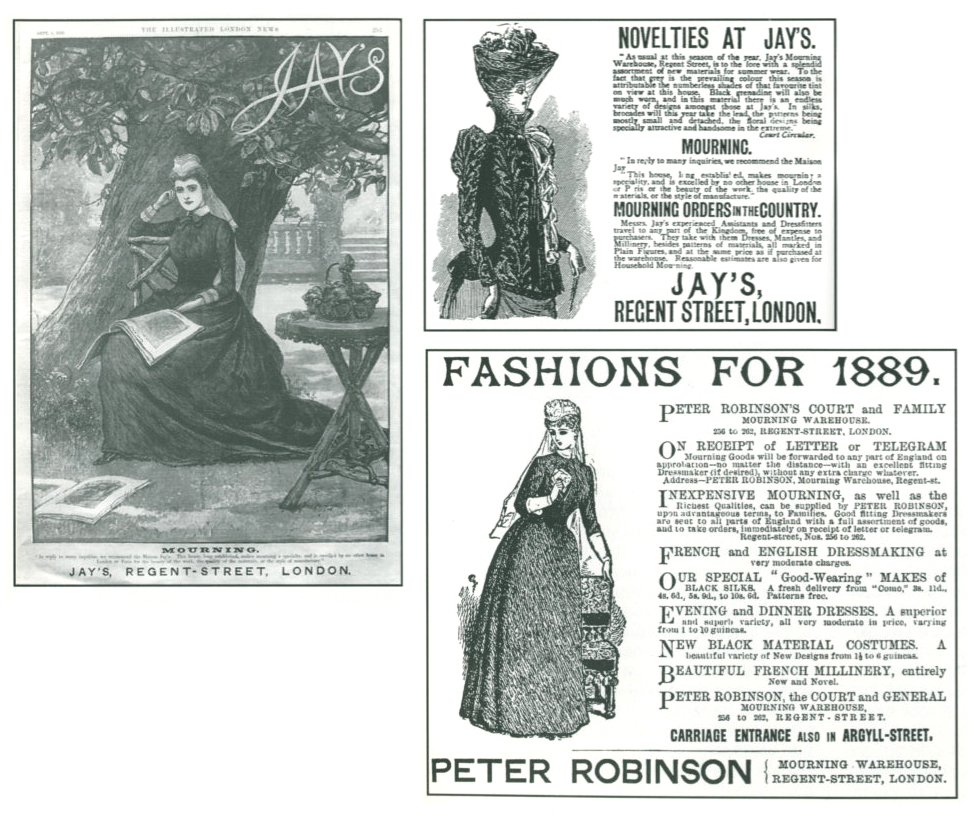
Black enamelled rings were easy to create with low gold content and make in great numbers. The producers in Chester, Birmingham, Exeter, Newcastle, Sheffield, Edinburgh, Glasgow, Dublin and London could supply Britain and its colonies with a large supply of rings that were transported for the purposes of mourning. A jeweller colour simply tailor the ring for the individual, or a mourning warehouse (such Jay’s; see below), could supply all the products necessary for mourning to a family, including the rings.
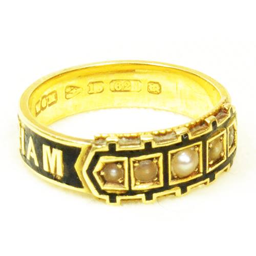
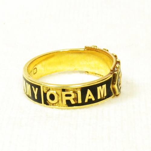
However, we see in this ring for Tommy, that the ring was quite bespoke:
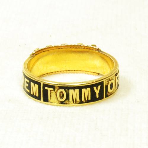
In 1881, we have the standardised mourning Victorian style, yet we have a personal statement etched into the ring. For construction, this was the concept the ring was built around. Unlike many other rings with the ‘mother’ and ‘father‘ titles pre-made into the band and created within a series of different sizes, this ring was made to order by the person in mourning for Tommy. ‘IN MEMORIAM TOMMY’ would be a set pattern that ‘Tommy’ was adapted to, rather than being a completely new design. Granted that ‘Tommy’ is a five letter name, the design could accommodate other names if the jeweller had to make another bespoke jewel for another, hence other rings may exist with similar designs.
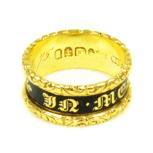
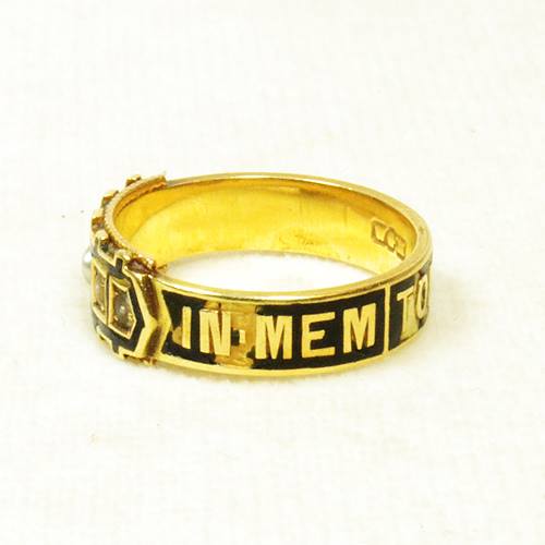
Looking back to the earlier ring, we have a similar style for the sentiment, but one which is far more standardised. ‘IN MEMORY OF’ is the most consistent statement found in jewels. As a collector or historian, identifying these rings, or any Gothic Revival jewel, is quite easy. Lettering in the enamel inlay is the most telling factor, with the highly decorative Gothic lettering harkening back to Middle Ages illuminated manuscripts (hence its connection to the Gothic Era).
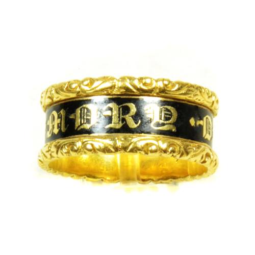
Comparing this to the 1881 ring, having the standard ‘In Memory Of’ statement doesn’t relegate the earlier piece to be any less bespoke, as the cultural need for mourning accessories had been producing pre-made mourning rings since the early 18th century, when higher production and reduced labour was introduced along with the Industrial Revolution. Zeitgeists, such as the death of Princess Charlotte, the high mortality rates from the Napoleonic Wars and the cultural unity that resonates from these, create a mourning industry that was emerging as its own commercial entity by the 1820s.
Bands with the black enamel and ‘In Memory Of’ statement were produced in high numbers, with various levels of quality and differ with weight and gold content. Simpler, cheaper ones were produced in two pieces, with the interior band being a separate piece from from the outer casing, which has the gold Rococo embellishments. Heavier pieces, which tend to be earlier (around 1810) are more narrow in the band and one solid piece. It wasn’t until the late 1820s and 1830s that the Gothic Revival was standard as a uniform and popular design that the rings could be produced in such numbers that they would have a steady demand.
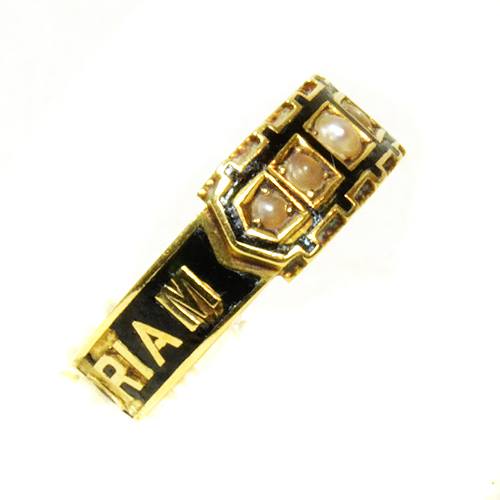
As a late Victorian jewel, this ring shows the development of the style. Using pearls and the buckle motif show that the ring was at the height of mourning jewellery for its time; a time when many of the designs in the Arts and Crafts movement led to aesthetic jewellery being produced for decoration, rather than resonating back to mourning jewellery as it would have during the turn of the 19th century and the Neoclassical movement’s influence on jewels.
What can be seen in the Neoclassical example of 1792 is that popular style was part of sentimental jewellery and that acknowledged mortality and life. The 1881 ring was made during a period of Queen Victoria being in mourning for twenty years; a period of standardisation in the monarchy which had not been seen in the early modern era. During the time in which the Neoclassical piece was made, style was influenced by the monarchy and aristocracy, due to the investment of the monarchy into the arts, the new wealth from the Industrial Revolution creating greater mobility for society to invest money within fashion and greater transit and communications between cultures influencing new styles.
The Tommy ring knew its status within society, as morning was identified as a specific style in the public eye. A person wearing this ring would clearly be acknowledged within mourning and the trappings of this would be without any decoration that would make them any less than sombre.
Symbolism within the pearl and buckle/garter motif are two-fold. The pearl represents tears and the buckle/garter is there to denote piety, love, respect and the honour of remembrance for the loved one (a remnant from its chivalrous history), yet the styles are so stylised by the Victorian uniformity in utilising these elements for so long, that they are subtle decoration for a ring that would act more like a tombstone for the wearer to remember the loved one by.
Viewing the continuity of a mourning ring between different eras is often the best way to understand the impact a certain time has on jewellery in general. Knowing that a political, cultural or artistic event may have changed popular fashion in such a way as to relate to mourning and mortality is important to understand the broader context of jewellery design.

Here, we have two rings that were a generation apart, yet tell us a tale of their values and times. Both were made under similar circumstances and both show a firm connection to their cultural sensibilities. From the high production of their style to the black enamel and the inscriptions, these rings were made for necessity and love within culture. Earlier examples can help to show that even these rings are an evolution, but no element about them cannot be understated for their creation and gravity of their meaning.
White Enamel
White enamel is the second most popular mourning material used, next to black enamel. Black enamel, being a colour that has represented death through to pre-history, was (and still is), the colour that was inlaid in jewels, most commonly with the ‘IN MEMORY OF’ sentiment. This was highly standardised by the 19th century, but in the 18th, there was much more flexibility with the use of sentiment and enamel colour.
Death, for its reasons of desecration and entrance into entropy, lead towards black, which in itself, is the absence of light. White, when in use, is the connection to purity, innocence and virginity, show the untarnished representation in colour towards a person’s morals and values. A young person who was not married was seen as unblemished in social status and the use of the white enamel to show this virtue is why white enamel is used in this context.
Colour and symbolism became the primary elements of the mid-18th century, with the introduction of the Rococo period and its infusion of naturalistic designs in jewellery. The previous Baroque period was notorious for its bolder, dominating design, however mourning jewels represent something far more personal than what could be reflected in grander statements of building and architecture.
Cost and the essential nature of wearing a mourning jewel requires that the wearer invest some intrinsic personal affectation into the jewel and that the jewel must reflect something of its time. The 18th century essentially established the industry of mourning, due in part to the Industrial Revolution and the rise of faster methods of production and a society which was becoming more and more mobile, with greater access to education and techniques.
In 1686, the revocation of the Edict of Nantes led to Huguenot goldsmiths and jewellers emigrating to Great Britain. This was when the previous allowance by Henry IV of France provided Calvinist Protestants (Huguenots) significant rights. With this retraction, the Huguenots bought with them skills which enabled the London trade to compete with Paris. This led to greater patronage with the influx of greater designs and new elements of fashion appearing as popular in jewels. By the mid 18th century, much of the values that were carried to Britain were instilled within the new industry and led to such elements as the Rococo designs in jewellery from its continental influence.
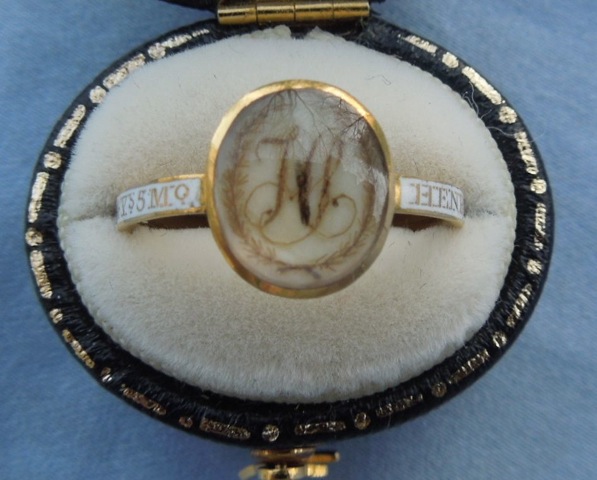
These new techniques applied to the white enamel that is displayed in Henry’s 1774 ring. Not only did the inlay of enamel become a process which was being influenced by the influx of skills from the continent, but the styles that the Protestants introduced into England allowed for a cross-cultural sharing of new ideas. White enamel as a virtuous display of young life was becoming a mainstream consideration, which this run from 1699 shows.
After this influx of Huguenot talent, the mourning industry grew along with jewellery development. Mourning rings were flourishing under a stabilised government that had not been seen under the Interregnum (Cromwell) period, as well as the new wealth that was developing from the burgeoning Industrialisation movement. Comparing this ring from 1730 to the 1699 piece, there is a large degree of standardisation in the design elements. This is a ring produced after the various elements of mourning in jewellery had become common enough to interpret without being seen as a jewel for aesthetic purposes. This is clearly a ring made for the purpose of grief in the style of its time. Gone are the memento mori elements (though these were still fashionable, however they had become smaller in size) and introduced is the name and dedication of the ring written around the band.
This ring contains the last moments of the Baroque period, with the straight edged band and not the nature-inspired, Rococo elements that would dominate the following thirty years.
Here, the Rococo design elements have become the mainstream fashion in jewellery and the influence on mourning jewels shows. In the ribbon/scroll/twist motif, the ring is highly fashionable and utilises the memento mori skull underneath the crystal, which is almost a statement against its fashion. This is a ring made for death and grief, so any association with being part of the fashionable Rococo movement is not an attractive prospect.
A heavy relation to the Henry ring from 1774 is seen once more in the white enamel and the development of the text around the band. As seen in the 1730 ring, all are standardising the sentimental dedication in the band, yet just adapting to whatever style was popular. With the message of the ring being so strong as to dominate the sentimental nature of the jewel, introducing a new style at the time would be contrary to what mourning regulation required. Mourning, at this time, was Court mandated and hence was a necessity within society to present oneself. Particularly when a young child or unmarried woman in a family has died, not utilising the white colour of the enamel would be considered inappropriate and a message to the values of the family.
For the purposes of creating a ring, unlike these bespoke rings with an individual dedication written into the bands, white enamel rings with ‘In Memory Of’ which have the written dedication inside the band, were not as common until the turn of the 19th century, when a century of building mourning style into the lexicon of mainstream society had cemented it as the requirement of a family. As it had become common, then a jeweller could pre-make several rings and have them ready for when wills required rings to be given out at a funeral.
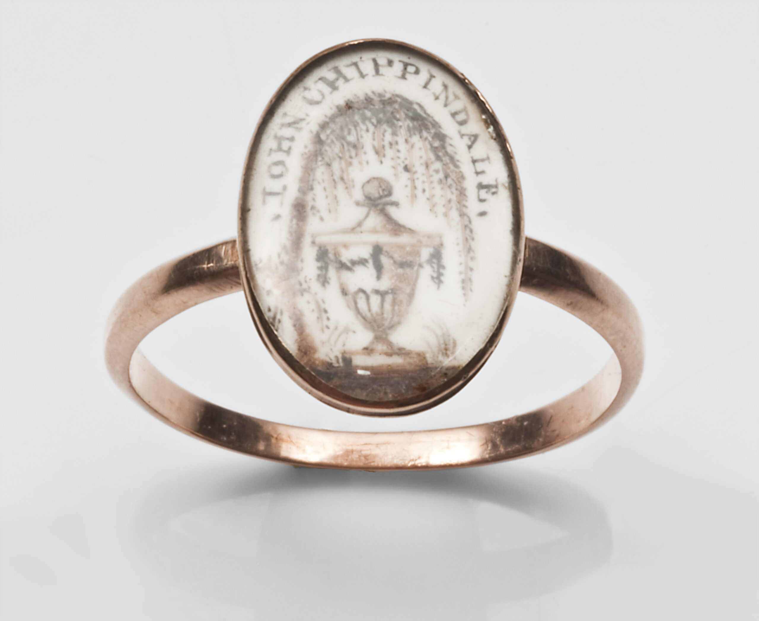
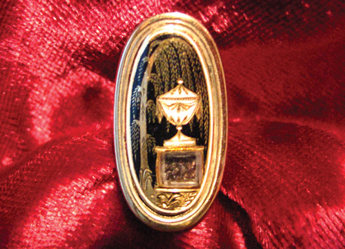
Henry’s 1774 is a close match to this piece from 1777. Here, the perfection of the Neoclassical period is captured with the depiction of the urn and weeping willow being superbly captured. Still with its crisp, sepia hues and exceptional focus on detail by the artist (note the source of the light from the left and the capturing of shadow to the right), the ring balances the style of the time with the white enamel band. Indeed, this ring and Henry’s are related in many ways. The oval shape is another identifier that was popular from the 1770s to 1780s, with the larger, navette shape taking prominence throughout the 1790s. Much of this was due to the popularity of the Neoclassical symbols themselves. As these grew popular, so did the need to have a larger canvas to display more in a ring, pendant or bracelet clasp.
Past the Neoclassical period, the streamlined geometric styles that were popular in the Regency era had shown a cleaner design to the band, with the focus on font and a singular element being the most prominent element to the jewel itself.
Everything taken from Henry’s ring is seen here at a latter date in popular, and sentimental, fashion. Combining the black and white enamel clearly denote the death of the loved one, but still show the purity of the person being mourned. By 1816, the Neoclassical period was being challeneged by the Gothic Revival, which was a swing back towards the simpler, ecclesiastical sensibilities of the middle ages. This reaction against the Neoclassical period and the excesses of the Regency was adopted by the Victorian era, yet all the elements of white enamel and the band with the surrounding dedication remained.
Blue Enamel

The use of blue enamel (used for royalty and suggesting that one was considered royalty) contains many mixed histories. Over time, many of the messages surrounding cobalt glass and blue enamel have been crossed, yet it fit very well into the Neoclassical paradigm post c.1865. The main reason for its use in heavier, symbolic terms is that the Neoclassical reliance on sentimental depictions and the allegories of love put the reliance on peripheral representations, rather than clear-cut statements of love and faith. Hence, blue enamel, considered royalty.
There’s Royal Blue and there’s Bleu de France. Bleu de France has been representing France and the French monarchy and the heraldry since c.12th century. This was adapted into jewels and you can see the obvious connection there with the message of royalty, especially considering the French influx into other cultures, as the French were considered the focus of style and fashion.
Royal Blue, is darker, with a hint of purple and red. This was thought to have been invented by millers in Frome, Somerset during a dress making competition for Queen Charlotte post 1761 (after she was queen). There’s the connection here in that her style would dictate a lot of the aristocracy would consider high fashion.
Growth
Society is the most important factor in any culture. No one can lead a society and promote absolute change without the society wanting to follow. Why was mourning and its fashion so popular and how did it get adapted? In the next article, all shall be revealed.
Dedication: Thos Sherman OB 1803 AET 63
Courtesy: James Edwards, British Museum, Pip Terry
Share this article with...